Space Coyote
BRANDING & IDENTITY REDESIGN
A true pioneer of the West Coast cannabis scene, Space Coyote approached me with an origin story deeply connected to the Californian environment.
The owners, responsible for all previous brand visuals, dreamt up the company in the middle of Joshua Tree while sampling their future product.
PITCH DECK DESIGN & ILLUSTRATION
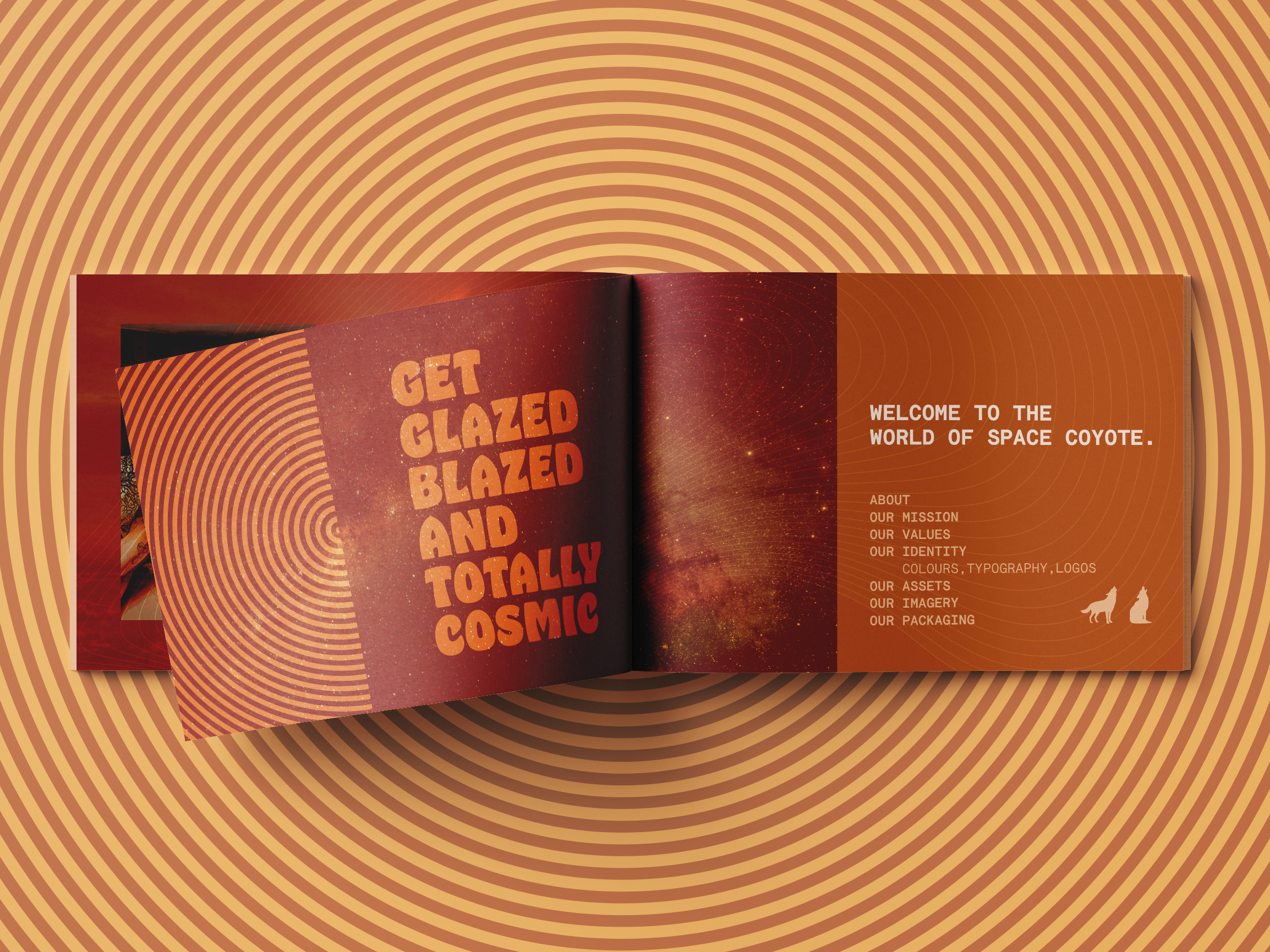
Rather than completely redesign their iconic logo, they asked me to freshen up their brand—to create a more legible typographic system, a more sophisticated colour palette, and a series of dynamic assets for future use.
PHOTOGRAPHY ARCHIVE & ILLUSTRATION
I created a visual system designed to evoke the warm, slightly retro feel of Joshua Tree in all their assets.
I then developed a set of compatible topographic and galactic illustrations to fully ground their origin story within their existing brand identity.
PACKAGING REFRESH
As an experiment, I pushed this project one step further. I took this new look and feel, and applied it to their existing packaging to see how this visual system worked in a retail environment.
Stepping away from the flat illustration of their past, I chose to create this dreamier approach to their pre-roll tins. Here, you see the new typographic system, new strain badge, topographic illustration, and galactic background at work.
OTHER BRAND ILLUSTRATIONS
✺
OTHER BRAND ILLUSTRATIONS ✺


